Douglas Detail Page
Douglas • Native E-Commerce Experience
Product Native product detail page for the Douglas app, replacing an embedded web view.
Impact Improved a conversion-critical shopping touchpoint in an app with around 614,000 users in Europe in 2019.
My Role UX/UI designer, redesigning the page structure, key interactions and native app patterns, from concept to delivery
Platform iOS and Android
Timeline Apr 2018 to Aug 2020
Context & Contribution
The Douglas app still used a web view for the product detail page, which made one of the most important shopping moments feel less native and harder to use on mobile.
I redesigned the page for iOS and Android, focusing on clearer product information, stronger visibility of add-to-cart and wishlist actions, mobile-friendly interaction patterns and a more consistent app experience.
The Process
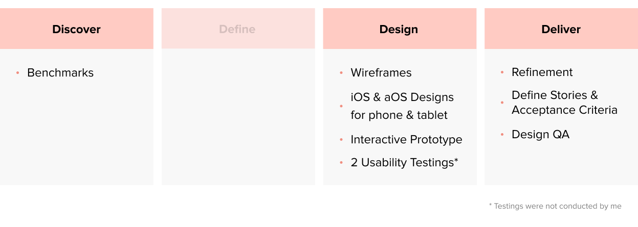
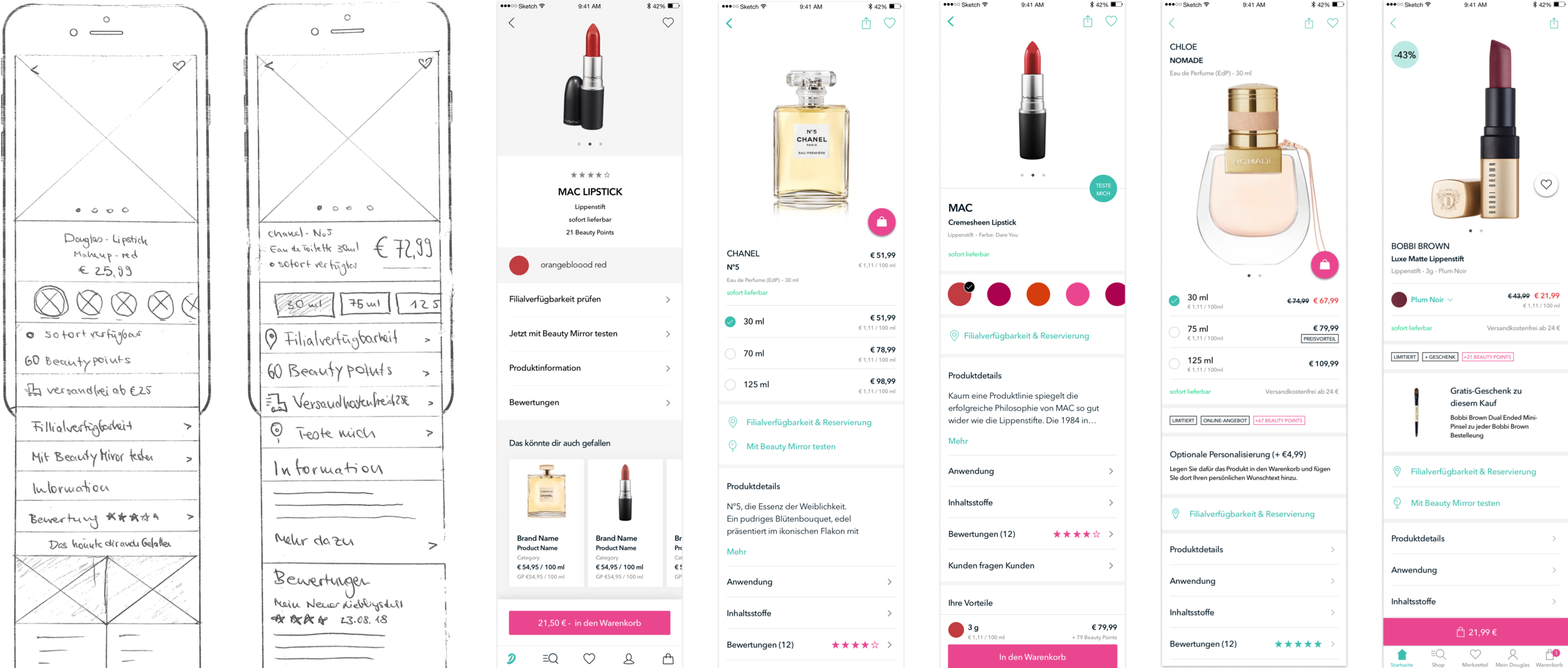
Creating Various Versions
As most content that needed to be displayed was already defined, it was all about trying out different versions.
Gathering Problems

Desktop First
Many elements suggest that the view was not designed mobile first. It has very small touch targets and utilizes UI elements that are not ideal for small screens.

A Lot of Content
The page is very long, as it displays a large amount of various information at once. This makes it hard for the users to keep orientation.

Missing CTA in Viewport
The previous product detail page lacked CTA’s above the fold, which in addition, were not in the viewport majority of the time
Testing Various Versions
Two rounds of usability tests were conducted, where we tested several versions of the product detail page. We tested in a lab, with 16 participants in total. The testers were female, in the age range of our personas, and both iOS & Android users. The first iteration gave us direction on what to improve, and the second one gave us security, that we were on the right track.

CTA Above the Fold
One of the most impactful changes was to display the add-to-cart & wishlist button above the fold, to enable a higher conversion rate. The price is also a lot closer to the CTA than it was before.

Replacing Dropdowns with Modals
As the initial product detail page was designed for the web, it utilized dropdown menu’s. To make the most out of the little space a phone has, I used a full screen modal. In addition, the list also displays the prices, as they vary depending on color.

Optimized Actions
Instead of displaying all possible actions in one spot, the new design spreads them out. In addition, ‘checking store availability’ and ‘reserving a product in the store’ were combined to one action, as it essentially does the same thing. The new design also introduced the Beauty Mirror, an augmented reality tool that enables users to virtually try on make-up products.

Shorter Page, Better Overview
Previously, the product detail page displayed everything on one page, which made it harder to get an overview. By utilizing lists, the length of the page was greatly reduced, this enables the user to choose themselves which information is relevant to them.

Creating Delight
After a suggestion from one of our developers, Elise Herro, we decided to include a little micro interaction when adding a product to the wishlist. It’s important to create small, delightful moments for the user, as that really makes a product. The dev-team had other great ideas as well, that really elevated the detail page.
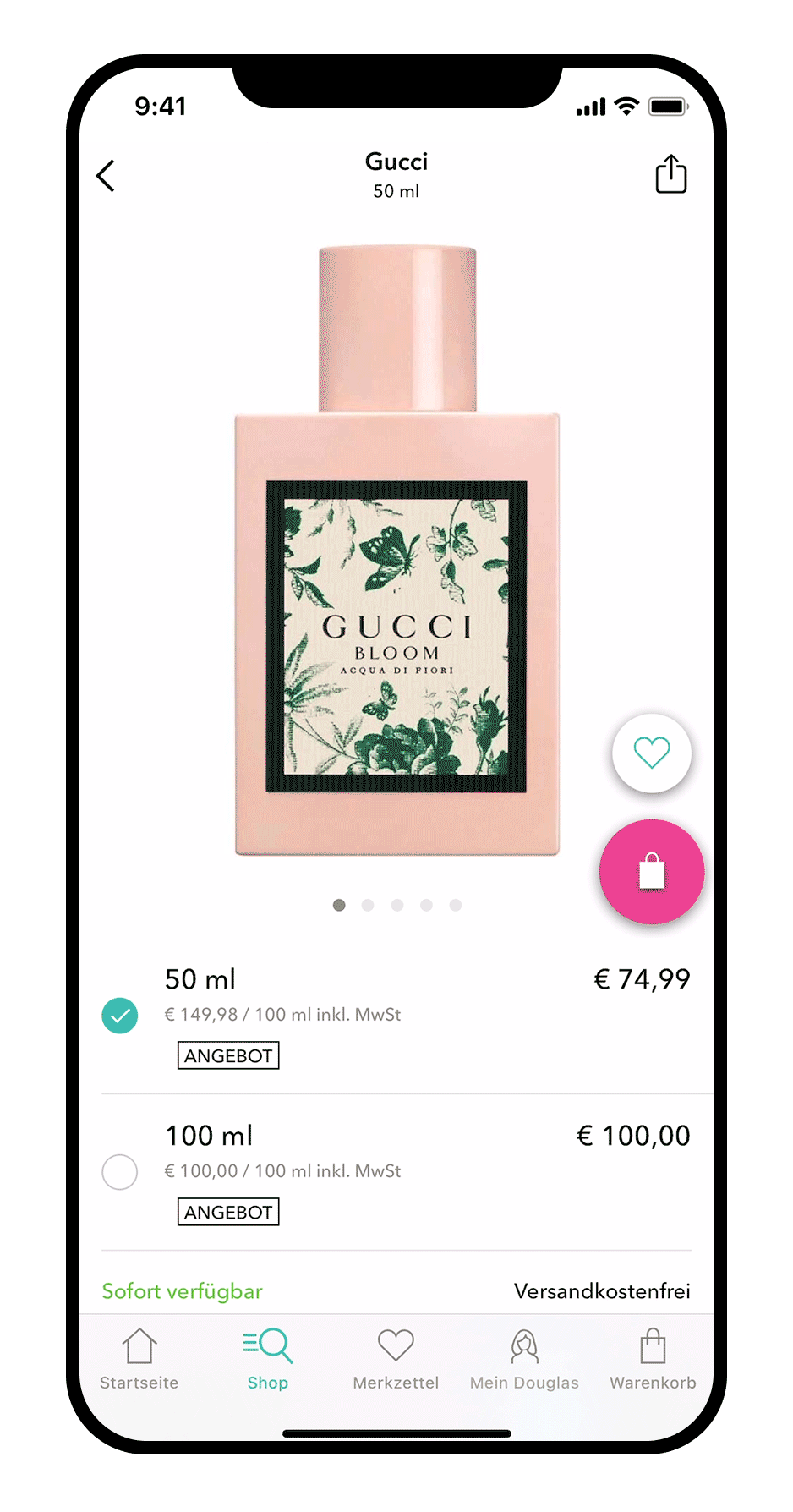
Optimizing for Tablets
As the Douglas App is also available on tablets, it was optimized for them too.

Impact of the Redesign
The redesign improved one of the most conversion-critical touchpoints in the Douglas app, which had reached around 614,000 users in Europe by late 2019.
Moving from an embedded web view to a native, mobile-optimized detail page made the experience feel faster, clearer and more consistent with the app. Stronger product hierarchy, visible shopping actions and app-friendly interactions supported orientation, conversion and a more polished mobile shopping experience.
Takeaways
Use realistic input in prototypes, testers can get hung up on things like e.g. base price
Usability testings can help immensely to mitigate discussions that are often based on opinions
The developers can have great ideas that help give the app character