Douglas Beauty Mirror
Douglas • Redesigning an AR Tool
Product AR make-up try-on tool inside the Douglas app
Impact Refreshed an existing feature for an app with around 614,000 users in Europe in 2019 & connected it directly to the shopping journey
My Role UX/UI designer, taking over after the initial proposal and leading the UI direction, flow refinement and delivery to launch
Platform iOS and Android
Timeline Dec 2018 to May 2019
Context & Contribution
Beauty Mirror allowed users to virtually try on make-up products inside the Douglas app. After an initial proposal had been created, I took over the project, became the design lead and reworked the UI direction to better fit the updated app experience and supported the feature through delivery until launch.
The Process

Defining Goals
-
• Enable displaying more than 3 categories
• Enable the before & after function of the SDK
-
• Adjust navigation for easier use
• Update UI with new design system to stay consistent in the app
• Use Snapchat & Instagram as reference, to enable familiarity with feature, considering a third of our target audience are heavy social media users
-
• Create noticeable entry point on homepage
• Integrate Beauty Mirror in shopping journey on the product detail page
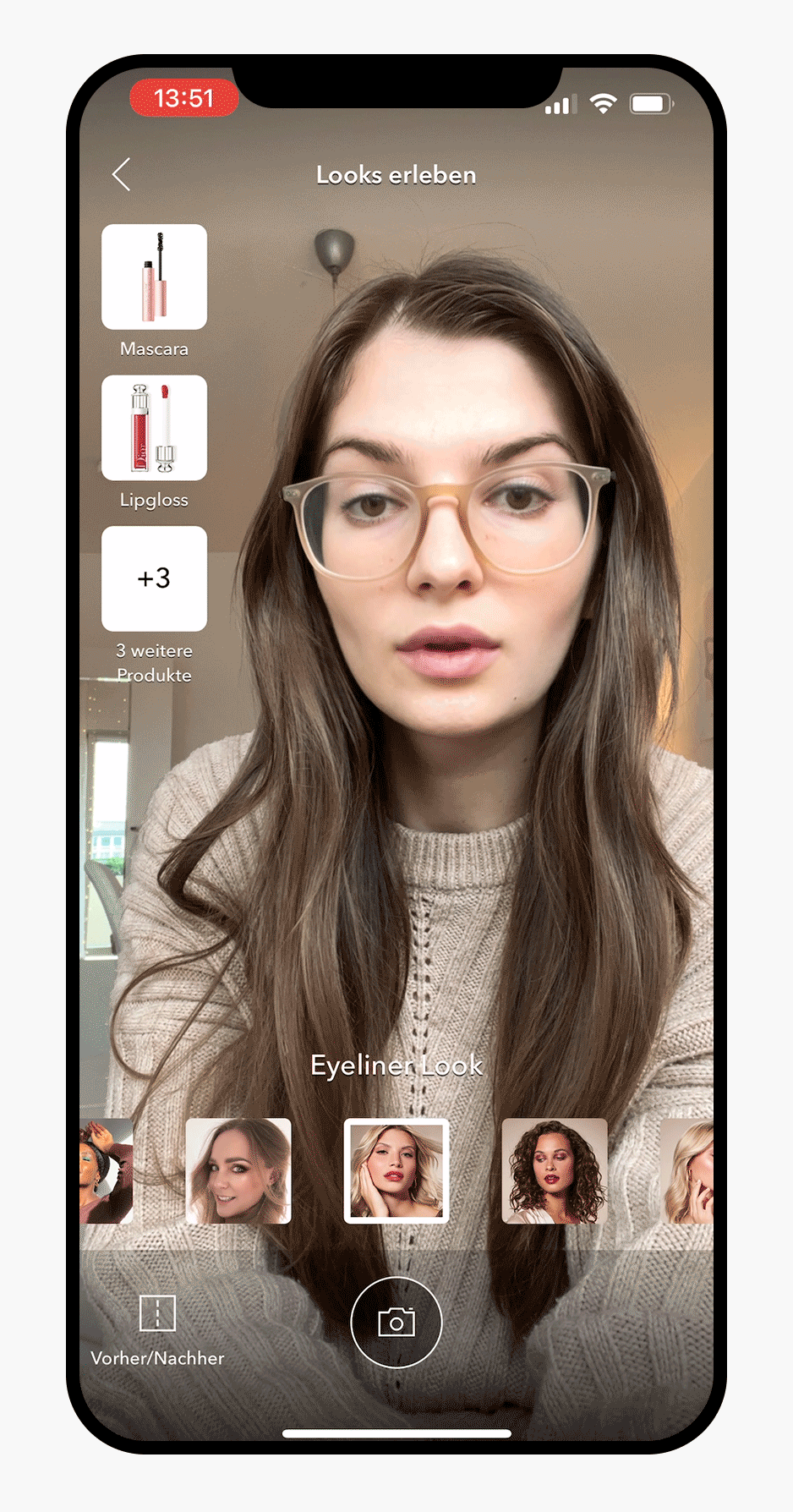
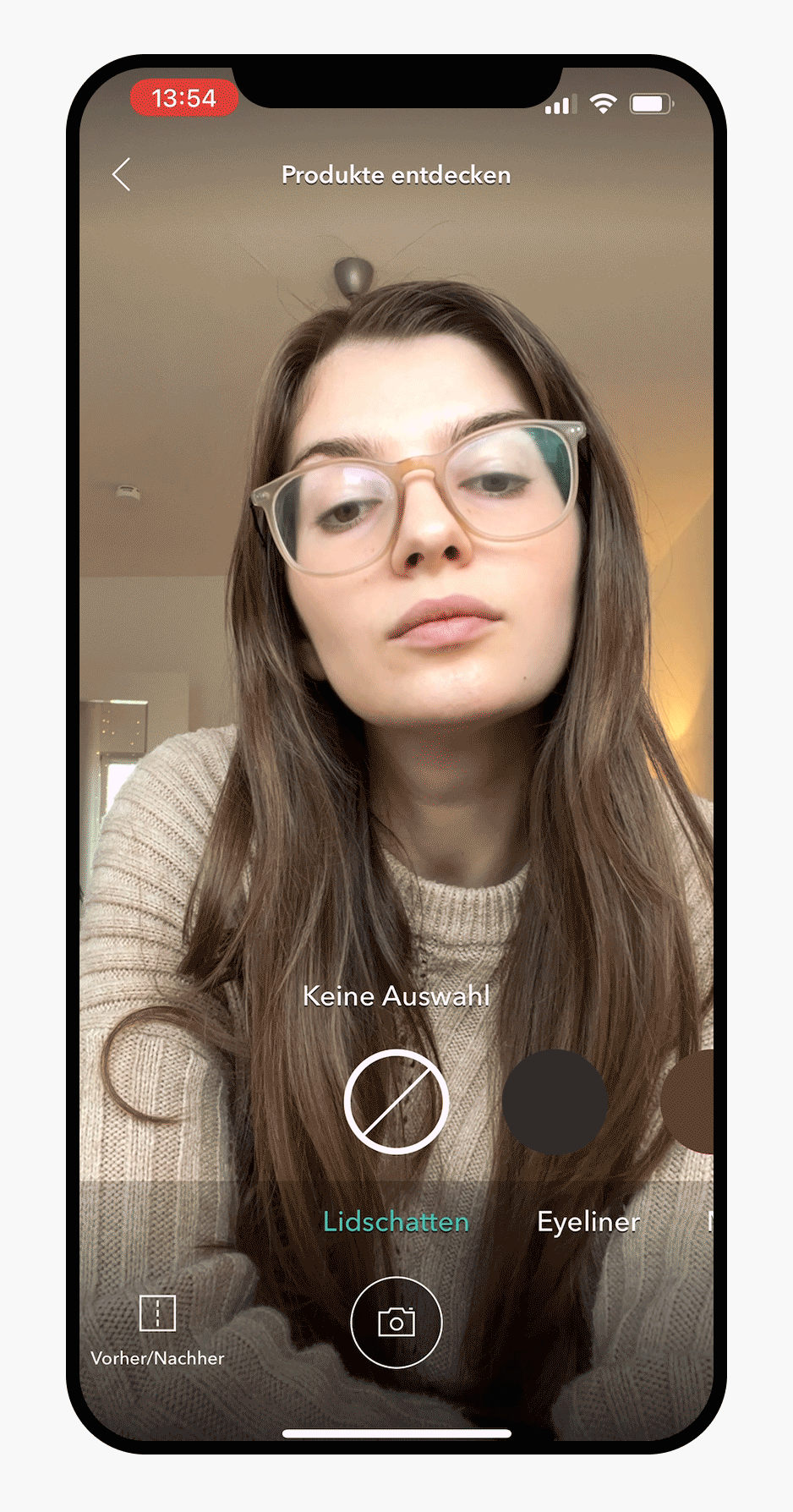
Discover Looks
The layout of the Beauty Mirror ended up being quite similar to the old one, this had the benefit of not needing to onboard existing users to what has changed. The main adjustments were:
Increasing legibility with the help of dark overlays and subtle text shadows
Adjusting the product images to squares, to ensure that wide products are not cut off
Adding category names below the product images to help identify the type of products
Centering the photo button to make taking a photo & sharing it a more central functionality, with the hope to drive popularity of the feature & app

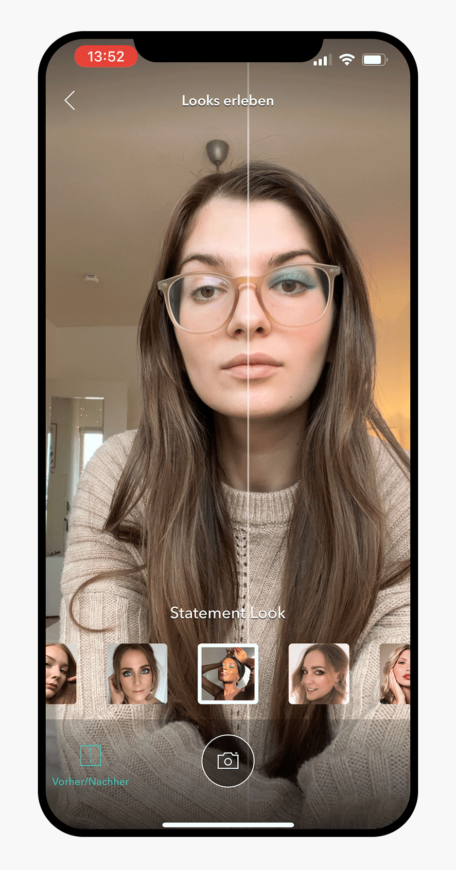
Before & After
The Before & After function helps understand all the subtle ways the looks & products have altered the users’ face. When active, suggested products are hidden to reduce cognitive load, which in addition frees up space to easily drag the divider.
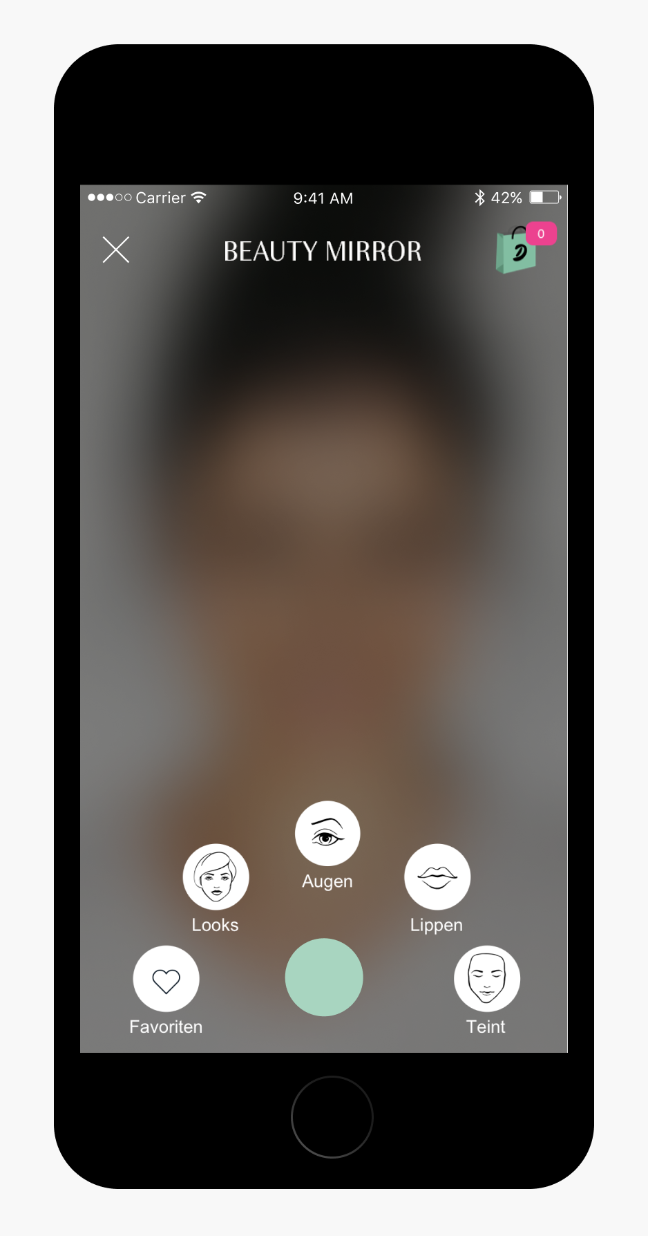
Discover Products
To discover products, the new design enables switching between make-up categories with a swipe. Previously, the users had to return to back to a menu to switch from e.g. eyes to lips, which took significantly more time. The new layout allows for far more categories than before.
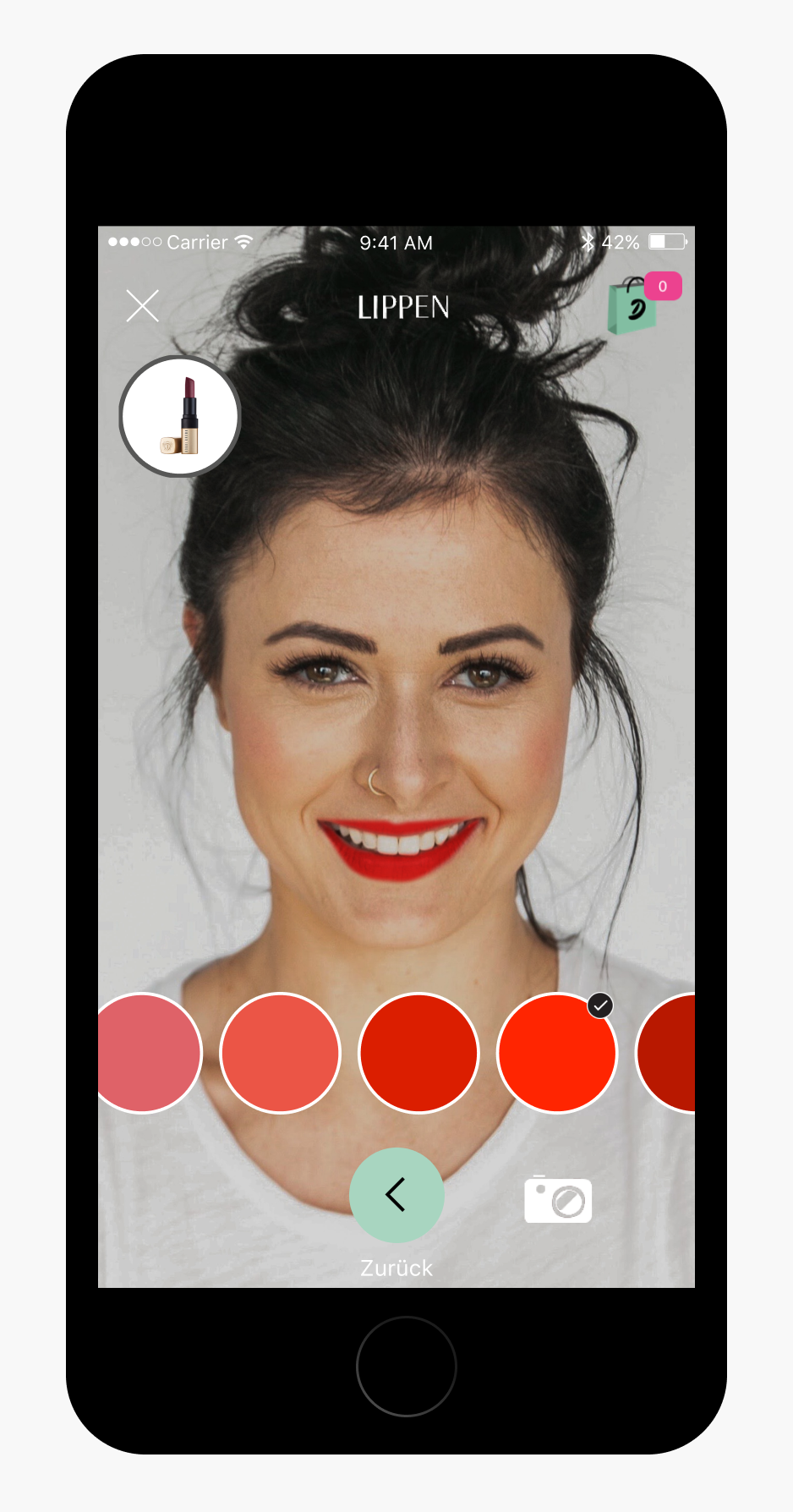
Trying on Product while Shopping
By including a button on the product detail page, the users can easily try on various colors and discover what suits them best. It solves the issue of not being able to try on the product before buying it online and helps ease the paradox of choice.
The Unconducted Testing
As testing was only done on very rare occasion by an external company, I decided to create a test setup that could enable us to test ourselves on site with little additional cost. In addition, I created a test plan & test script. Because of the strict timeline, full roadmap and low UX Maturity at the time, the testing ended up being cancelled.
Testing Room
Observation Room
Impact of the Redesign
Beauty Mirror strengthened an existing AR shopping feature inside the Douglas app at a time when mobile, personalization and digital beauty services were becoming more important to Douglas’ e-commerce strategy.
By reworking the UI with familiar patterns from Instagram and Snapchat, the experience became easier to understand and more intuitive to use. Connecting the feature to the homepage and product detail page also made it more relevant to product discovery, helping users explore shades more confidently while shopping.
Takeaways
The entry point on the product detail page should have been placed closer to the image & colors, where it contextually belongs. It should have been above the fold, to increase visibility and therefore usage
The primary mint color that is used to signify active states is not sufficiently visible. It would have been ok to break consistency in favor of better contrast.
Instead of creating a long and ‘ideal’ testing concept & script, I should have conducted a quick and informal hallway test with 5 subjects before presenting the designs
Commit to deadlines with a clear date, to reduce risks of misunderstanding
Be open to feedback & suggestions by the developers
Credits
Photos by Mathilde Langevin & Jake Nackos on Unsplash