Scratch That
Bachelor Thesis • Design of a Mental Health App
Product Mental health app concept focused on low self-esteem
Outcome Received a 1.0 grade & explored how psychological content can become more accessible
My Role Sole UX/UI designer, covering research, concept, design & prototyping
Platform iOS
Timeline Apr 2017 to Sep 2017
Context & Contribution
Scratch That was my bachelor thesis: a fictional app concept around low self-esteem, a topic I chose and defined independently from research to prototype.
The project explored how psycho-education could become more accessible and easier to integrate into everyday life through a step-by-step program with short audio sessions, small reflection tasks and transparent supporting content.
The Process
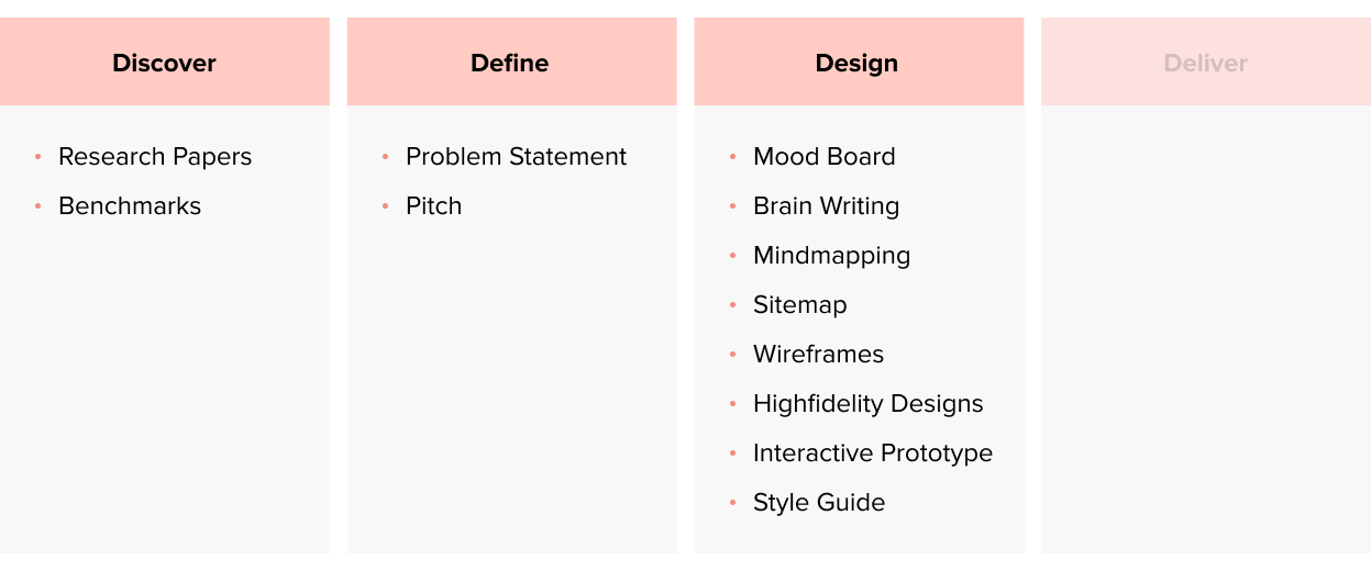
Research & Benchmark Insights
Insight #1
Self-destructive views lead to vicious cycles. To break them, it is necessary to raise awareness of causes and consequences.
Insight #2
To rewire ones’ brain and create new healthy behaviors, it is necessary to practice daily, to have long-term results.
Insight #3
To raise levels of self-efficacy, the tasks at hand need to be small and manageable.
Insight #4
Social upward comparison strengthens incremental beliefs, which motivate people to keep improving themselves.
Insight #5
Misinformation & lack of transparency is an issue in many mental health apps.
Insight #6
A common pattern in mental health apps is overly positive imagery & content.
The Concept & Pitch
The Design

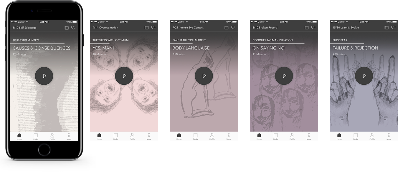
Make complex content easily consumable
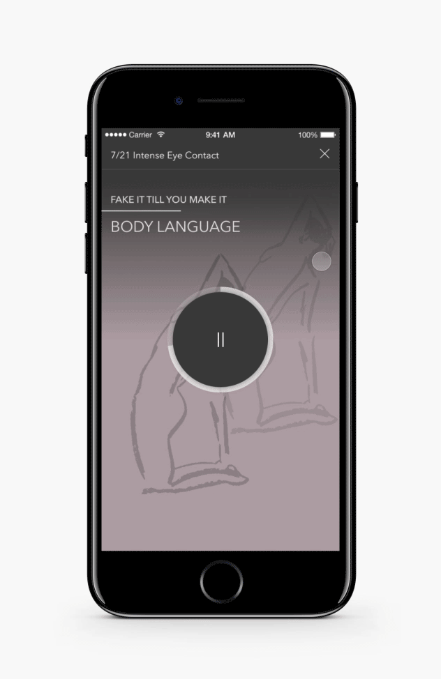
To reduce friction, all the user has to do is show up and listen to a short podcast of 5-10 minutes. It’s the main functionality stretching over the entire viewport and after the users have completed the daily podcast, a new session is unlocked by the next day.
Make content actionable
Creating small & manageable daily challenges that complement the podcast will help raise levels of self-efficacy and ensure a better incorporation of the learned content into ones’ routine. Right after the podcast is done, the UI adjusts to reveal the challenge, by making it appear above the fold.

Display Related Content
By swiping down, users can see related, credible content in the form of articles, quotes and videos. This enables users to dig deeper and in addition can create social upward comparison, when displaying success stories.
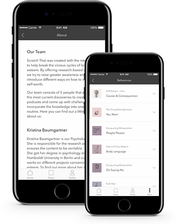
Credibility & transparency
The podcasts & challenges should be created by therapists. It should be clear who creates the content and what sources are used. This is easily accessible in the more tab.
The Prototype
Outcome of Scratch That
Scratch That received a 1.0 grade as my bachelor thesis and showed how a complex mental health topic could be translated into a clear, approachable mobile app concept.
The outcome was a step-by-step program with short audio sessions, small daily tasks and accessible psycho-educational content, designed to make self-esteem work easier to understand and integrate into everyday life.
Takeaways
Even if not required for a project, do user research and confirm your hypothesis
Don’t skip on usability testing’s, even if you don’t have a lot of time to adjust the designs
The color scheme was picked so dark & muted on purpose, yet the concept behind the “embracing the dark & twisty thoughts & feelings” might still make the app visually unappealing
One examiner suggested having the colors become lighter & brighter with each completed session
The terminology of “packs” and “sessions” might be confusing and unclear, it would have been smart to test potential user’s mental model
The start page with the podcast has various issues e.g. unclear icons, too many titles, unclear session picker
Credits
Icons: The Ultimate by Iconnice, Essential Set by Madebyolver, Multimedia Collection by Gregor Cresnar
Images: Screenshot of www.youtube.com/watch?v=Ks-_Mh1QhMc, Eye by David Lienhard
iPhone Mockups: iPhone 7 Psd Jet Black Mockup by Pixeden, iPhone 7 Mockup by Ramotion